PROJECT OVERVIEW
Redfin has become one of the most trusted and valuable real estate apps available, with everything homebuyers need when searching for a new home. It provides a range of tools for conducting research on everything from the overall market to specific home values.
However, they do not, nor does any other service provide tools that cater to real estate investors. Designed with the commercial real estate investor as the target user, it allows them to personalize their search process and make informed decisions on potential investment returns. We added unique features such as mobile alerts and 360˚ walk-throughs to make this app truly one-of-a-kind. Download the app at www.redfin.com
PROJECT DETAILS
Roles: Sr. Experience Designer
Team: Christina Scanlon, Omid Dorani
Deliverable: Working Hi-Fi Prototype
Tools: Sketch, Photoshop, Adobe XD, Pop.app, Sharpie & paper
Research + Key Findings
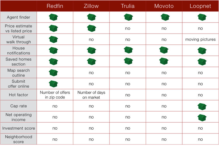
Before we could "revolutionize the real estate market", we had to understand the industry as a whole, Redfin's competitors and the difference between home buyers and investors. Our research found that while the real estate industry was detailed and very tech savvy, the content was focused on home buyers and there wasn't much dedicated information for investors other than very basic information found on Loopnet. This was a sore spot for investors as Loopnet is a paid subscription service that returned very little.
COMPETITIVE + COMPARATIVE ANALYSIS
The competitive analysis led us to find the investment gap within the real estate market and helped drive our content solutions.
UNDERSTANDING THE MARKET INTERESTS
We conducted interviews with both residential and commercial investors and found that they utilize an entirely different set of data than homebuyers. What interests an investor most is the net operating income and the capitalization rate. There was also a big interest in the ability to verify the state of a property and neighborhood without seeing it in person.
PERSONA - TARGET USER PROFILE
Once we can understand the market, competitors and stakeholders, we can draw insights from the data collected. Capturing, organizing and understanding this data helps to validate the strategy and direction and we can now develop user personas, scenarios and flows.
Johnny Nestegg is a seasoned real estate investor but he struggles in the process of finding and buying property due to how difficult and time consuming it can be to assess the viability of an investment. His goal is to find new and smart investment properties that allow him to retire with his wife. He needs to calculate the investment return of potential properties, verify descriptions are accurate for properties he is interested in, and determine what rent a property can get.
CHOOSING THE SIMPLEST ROUTE - A SAMPLE USER FLOW
In this particular flow, our persona, Johnny, has one clear objective, to purchase an investment property. While much of his task will depend on his search requirements, we created a streamlined path to the goal.
Ideation + Design Process
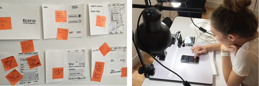
Our team collaborated in participatory design studio exercises to get our initial ideas on whiteboards. Loose sketching and open discussions allow us to create fun and unique solutions before refining them on paper and prototyping. Do we involve our developers at this stage? Yes! Developers can not only keep our initial featur-itis in check but they have great ideas and can make sure what we want is feasible.
ROUGH + REFINED SKETCHING
Loose ideas are thought-out and drawn to scale in both rough and refined sketches. We used the refined sketches for initial Wizard of Oz (WOZ) testing, which allows us to perform usability tests much earlier in the prototyping cycle than is typically done.
PAPER PROTOTYPING
Getting the design out early and testing often allows us to see what concepts work and what might not. After initial WOZ testing we made a few core edits and then tested these refined sketches as a paper prototype.
DESIGN. TEST. LEARN. REPEAT.
Testing often, the user feedback drove multiple iterations as we conducted usability tests and task analysis. View a sample of my remote user testing session via lookback.io
WIREFRAMES + USER PATHS
From the initial test feedback we can create detailed wireframes for each of the pages along the red routes. This will allow me to identify and prioritize any usability obstacles for key user journeys that may lie beyond our user person
Defining the Style
Creating a new component of an already existing company means staying on brand. Working off of the existing Redfin style, we created slight variations for the Investments app. This consisted of unique iconography, the introduction of a gold color, and a concise way-finding system.
INTERACTION DESIGN
We incorporated simple interactions using clear, familiar and consistent styles. An initial loading screen used simple loading animation followed by taps, scrolls and swipes to navigate the app. Within an image, the user can pinch to enlarge or decrease the magnification.
A/B TESTING THE LISTING PAGES
We decided to test the usability of the listing pages by running two versions of the prototype. Version "a" carried a listing-specific navigation at the bottom of the screen which meant that it changed from the higher level pages. Version "b" maintained the bottom navigation throughout the entire app and added listing specific icons to the top of the property page.
Features + Highlights
Features are fun but keeping them under control is key to understanding what works and what might not. Creating a new app dedicated to investment properties filled the gap in the real estate market. Utilizing Redfin's existing features, we created a few delighter's to make this app even more useful for real estate investors.
360˚ VIRTUAL WALKTHROUGH
Virtual Walk-throughs create fully immersive 360˚ experiences with clear perspective and definition that allows the user to effectively judge size, space and dimension, allowing prospective investors to visit and explore properties online as if they had physically stepped foot inside the building itself.
Prototyping
Looks and feels just like a functional, finished mobile app. Stakeholders can tap, swipe and scroll through full content to sign off before development. View the animation below or try the Marvel prototype for yourself (prototype is optimized for ios task analysis).
NEXT STEPS
As with any project it is best to roll-out features in stages. This allows us to test and analyze each feature independently instead of overwhelming users with large scale changes at once. For every job we work on I provide a list of next steps or additional features for consideration. In the case of Redfin, both recommendations are currently in progress!
MOBILE ALERTS VIA APPLE WATCH APP
Knowing when new listings come up can be key to getting the jump on other investors. It also helps to know if and when you're nearby a property so you can view it in real life. The initial version of the app included email alerts but tech savvy users can download an apple watch app that notifies them on the go.
AUGMENTED REALITY WALKTHROUGH
Viewing properties can be exciting and overwhelming and often with investment properties a person has access with no listing agent. An augmented reality walk-through feature allows users' information on specific amenities, structural pieces, appliances and conditions that they might not be able to ask about. When a person is viewing they simply hold their mobile viewfinder to find "hotspots" that are loaded with pre-determined data. ie. "This property features new double paned Anderson windows"
LOVE + APPRECIATION
There are certain projects where everyone’s role is just right. This was one of those times. It was amazing to work with so collaboratively with so many talented designers. Great big thank you’s to the investors, real estate agents and of course to Redfin, a truly amazing company.


