PROJECT OVERVIEW
Marbles: The Brain Store is renowned for their excellent in-store customer service; however, users find their current website to be “confusing, cluttered and difficult to navigate”. As part of a larger team, I was tasked with reorganizing and building a clean navigation system for users to find, compare and purchase products. This included an intuitive way finding system that guided users from their initial search through item selection and checkout.
PROJECT DETAILS
Roles: Sr. Experience Designer UX/UI
Team: Christina Scanlon, Ravi Trivedi, Mike Ahn, Anu Rana, Kim Calderone
Deliverable: Working Hi-Fi Prototypes, Annotated Wireframes
Tools: Sketch, Adobe XD, Sharpie, paper & post-its
PAIN POINTS
Confusing navigation
Difficulty finding desired products
Time consuming process
USER GOALS
Easily find desired products
Make informed purchases
Move through the site efficiently
SOLUTIONS
Create an intuitive navigation
Re-organize products/categories
Streamline the checkout process
Research
On large projects such as a website redesign, the discovery phase is key to creating an informed user experience. Since no one on our team was familiar with Marbles, we used many research methods to gain the information needed, organize and streamline the complexities and disconnect between the physical store and the website. This stage began with a heuristic review of the Marbles website, documenting usability flaws and other areas for improvement.
COMPETITIVE + COMPARATIVE + LAYOUT ANALYSIS
Once we understood how the Marbles website worked, we had to understand who their competitors were and how each of their sites worked too. We did this by running a comparison of each website including usability testing sessions and purchasing products through each company that directly competed with Marbles. Since we were redesigning the website it was not only important to know how the competitors work but how they looked (layout analysis). Often we can see aspects of a website that are common to an industry which feels "normal" to a user.
STAKEHOLDER INTERVIEWS + CONTEXTUAL ENQUIRIES
Our team held conversations with key contacts in the organization from executive managers to employees as well as enquiry interviews with users as they used the existing website. This allowed me to better understand their tasks and challenges.
Research Analysis
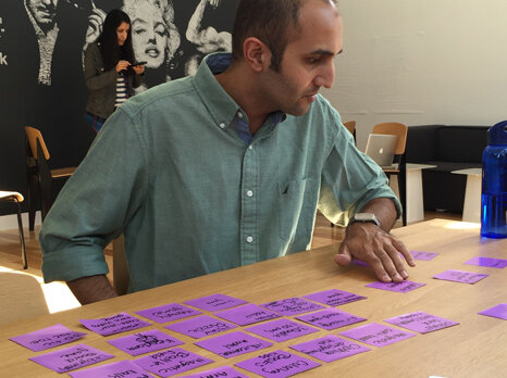
I was able to draw insights from the research and data collected, capturing, organizing and drawing inferences from the "what" in order to understand the "why". This information allowed me to develop user personas and scenarios but I still needed more insight into the way users understood the navigation. To do this I initially conducted both open and closed card sorting exercises.
CLOSED CARD SORT
My initial exercises had users grouping items into pre-determined categories. In doing this, many users either didn't feel certain items belonged to any specific group or they didn't understand what the item was and left it out completely.
OPEN CARD SORT
I changed the format and allowed a new group of users to determine their own categories and organization. This led to more and more categories with many users placing items into individual groups.
WHY THAT DIDN'T WORK (AND WHAT DID)
Card sorting should have allowed us to find which items users felt would best group together. It became obvious that while we had a good understanding of the products, our users didn't. Feedback consisted of not being familiar with certain categories to not understanding what the product even was. Since we recorded all of the interviews, enquiries and exercises, we decided to take the transcripts and create a word cloud. Immediately, specific words popped out to form categories. While the users may not have been able to organize what was in front of them, they certainly knew what they wanted and this hierarchy formed the basis for the architecture and site navigation.
SITE MAPPING
In order to create an intuitive and streamlined website, we needed to organize the sections and how the user would interact between them. The goal was to build seamless paths that allowed the user both direction and flexibility. Our sitemap would not only serve for organization on the site but also for our team to know what we needed to create and keep track of who was doing it.
USER PERSONA - TARGET CUSTOMER PROFILE
As with any e-commerce website the target customer base can be very diverse. From kids looking for fun toys, and games to older adults interested in maintaining their brain health, we had to take many situations into consideration. We created groups of different personas but focused on the most common user as a thirty-something year old parent purchasing a gift for a younger child (55%).
GETTING EDDIE FROM HERE TO THERE, EASILY
Understanding the complete structure of the website is one thing, but we also had to understand how Eddie interacted to achieve his goals. To make sure our thirty-something persona was able to move quickly and easily, we created a path which he would use to search, review and purchase a product.
Ideation + Design Process
Once everything was organized and we had extensive data on who was using the site, what they expected of their experience and why they liked and disliked the current site, we could bring it all together. Our team collaborated in a participatory design studio exercise to get our initial ideas on the board before taking them to paper and lo-fi prototyping.
WHITEBOARD CONCEPTS
By getting it "on the wall" we were able to take pure ideas and begin to see how they related to the users needs.
SKETCHING WITH PEN + PAPER
From the concepts on the walls, we created rough and refined sketches, working out the elements the website must have, as well as the unique features that the users enjoy, and that give Marbles a competitive advantage.
LO-FI PROTOTYPING
Getting the design out early and testing often allows us to see what concepts work and what might not. With Marbles we tested very lo-fi mockups using pen and paper to make changes quickly and get feedback a few times through before spending time on digital wireframes.
Testing the Navigation
The feedback from lo-fi prototyping gave us reason to create a couple different versions of the navigation. Initially, we were considering a text only navigation, but our test users once again found the names to be confusing. With the rest of the website receiving positive feedback we went on to create two different navigation styles for A/B testing. Creating the icons digitally removed any issues with users not understanding the sketched version.
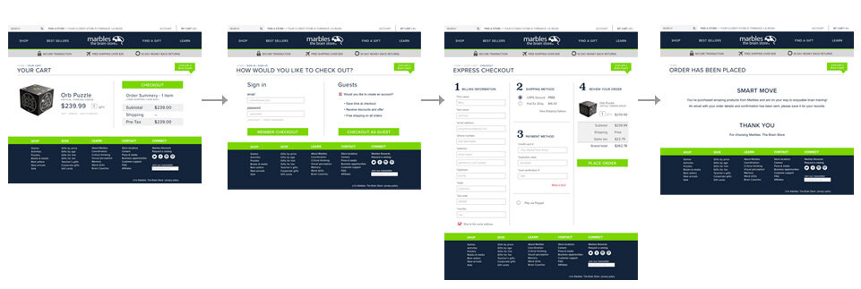
Checking Out in 4 Simple Steps
We wanted the checkout process to be clean. Since Marbles products are on the expensive side and the company is not a highly known brand, our users made it known that security was a concern. Keeping this in mind we created a very quick process that reassured the customer with subtle prompts and notifications.
OPT-IN ACCOUNT SIGN UP
This nifty feature allows a user to simply check a box to create their account. Since they are purchasing an item and will need to include their shipping information, the "opt-in" allows the customer to use that information as their account profile. No need to fill out another form, in fact, we’ve kept this form to an easy four step process on one single page. Nobody likes forms.
SECURITY BAR
The grey bar directly under the main navigation appears throughout the checkout process. It is there to reassure users that not only is their transaction secure but they have free shipping and if for any reason they are not happy, they have 30 days to return the item or items. This feature tested highly with our users giving them a sense of professionalism and security.
Hi-fi Prototype
Looks and feels just like a fully functional, finished responsive e-commerce website. Stakeholders can click and scroll through full content to sign off before development. View the animation below (prototype is optimized for task analysis).
Next Steps
Reorganization and seamless movement through the website are the biggest features of the redesign. In the next version I would create a tool to aid in gift selection. It would be a great feature to help users who are not familiar with either the product or the gift recipient as we've found many users are buying gifts for grand children and extended family members. And, if you look closely at the whiteboard sketches, I already have a concept for it.
Love + Appreciation
The Marbles team was great! So full of energy and willing to dig in to go the extra mile whenever needed. A big thank you to the employees and customers who spent time with us while we poked and prodded into the why’s of everything.


